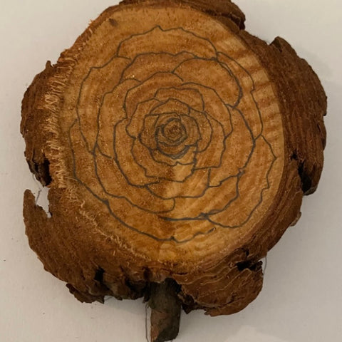
Have you ever looked at a piece of wood and thought to yourself, “wow the grain looks so much like ____!” Today I want you to find one of those pieces and sketch out whatever you see in the grain. For my example, I’ll be walking you through how to burn and color a rose using the natural wood grain of basswood. If this makes absolutely no sense to you, look at my picture below.

First stare at the middle of the wood and notice the way the wood grain has a familiar pattern - similar to the one you find in a rose. Following the circular grain, your mind will start to see an image which can be the basis of your design. Sketch it out and you’re ready to burn!

Before we get any further, let me remind you who I am. My name is Ashley B and I am the wood burner for Firecrafted Serenity, my pyrography business! I have been burning for multiple years now, always looking to push my own abilities and understanding of the art form. Being able to share my process and tips to those who are either just starting, just now discovering wood burning or those who are experts in it - is so special and why I do it!
Let’s get back to it now that I’ve introduced myself! Looking above you can see how I doodled a little rose on computer paper based on the grain of the wood piece. I did outline the wood to get the right shape for planning - this isn’t a necessary step but I wanted to mention this method as some might find it helpful! Looking below you can compare the drawing above to it actually on the wood using the grain as guidelines. Flower designs are super easy if you just follow the spiral pattern effect the wood grain can create.

Once you have your sketch all done, you’re ready to get to the fun parts - burning and coloring it in!

Once burned in, look at your watercolor options and decide what color scheme you want. For this piece, I opted to do shades of reds and pinks, all beautifully shimmery of course! When I paint, I like to go in without a plan and see what the piece leads me to do. If you’re a planner, look at how many different colors you have versus blank spaces and create a pattern to follow for easier painting! 
Alternating between the red and pink hues, I painted each petal a different shade then it’s neighbor. This is what felt right to me, do what feels right to you! Always make sure to rinse your brush between hues if you’re alternating between light and darks colors. This helps to prevent cross color contamination especially in your pastel colors!
I did use a mix of shimmery and glittery watercolors to give my rose extra dimensions and points of interest that catch the light as you look at it but your piece may look best with matte watercolors. Play around and see what looks best to you - there is no wrong way! In some parts I decided to mix all three colors to give the rose a fourth color intermixed. As I’ve said many times before, I tend to play around with colors as I go along, knowing it can always be added upon if I don’t like it. Part of the fun of experimenting is having things go differently then expected!


Above you can see the rose all colored in, taking note that I did add some color to the outside wood pieces that look like the outermost petals of the rose. I did this to complete the design and illusion I was playing off of. The palettes I used to complete this piece are pictured above as well; the mini flower palette, half pan moon pan and a sample shell, all of course the smiling hippo watercolors.

Don’t forget to let your piece fully dry before handling and seal in the watercolors for best final products. This picture was taken as it was drying, prior to sealing. Grab your scrap pieces of wood and see what you “find” in them to burn out! You may surprise yourself with your creativity and the end product once colorized! Get experimenting my friends!

