
Hello everyone! My name is Jazzy (@j.l.s_art on instagram) and I’m an artist who focuses primarily on portraiture. Today, I’m gonna talk about painting different textures, specifically hair texture. When I first started working with watercolor, hair texture was something I found intimidating. Hopefully, these tips will help you avoid some of the “experiences” (because in art, there are no mistakes) that I had.
I wanted to paint something somewhat Valentine’s Day themed, so I decided to challenge myself by painting a couple. I also love the series Lore Olympus (artist: Rachel Smythe @usedbandaid on instagram), so I took some inspiration from the characters Hades and Persephone and went for a monochromatic* pink for the woman, and blue for the man. I chose a black and white reference shot and made my sketch. I also gathered my materials of a pencil, watercolor paper, painter’s tape, a cup of water, a small round brush, Crimson Red, Cerulean Blue, Phthalo Green, and Ivory Black watercolor paint, and a glittery green, rust orange, pink, and blue paint from Waves of Expression’s shop.
*A monochromatic color scheme is a color scheme that uses only one color, but includes different tones and shades to add depth.

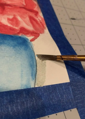
In the sketch phase of painting hair, I focus on the overall shape of the hair (i.e. cut, weight, direction) rather than worrying about details. It’s tempting to start working on individual strands, but this can often weigh down the overall look of the hair and muddy up the final product if you change any part of the design. After I’ve finished my sketch and am happy with how it looks, I erase the sketch so that all it leaves behind is a faint outline. From here, I add water to the back of the page to prevent curling, tape the page down, and start painting.

For the first layer of paint, I did a light wash over each figure before going in and loosely reinforcing darker areas. At this point I like to keep my painting fluid and just consider overall values. My “rule of thumb” for watercolor painting is to move from general to more detailed, and just layer, layer, layer. I also added a slight background to this piece from the reference photo. There were some nice abstract rock-like shapes in the background so I made an outline of the rock and used the wet-on-wet painting technique* to give it a natural, washed-out feel.
*The wet-on-wet technique is when you use wet paint on wet paint to give the paint a fluid appearance where some colors bleed into others.

After getting the base coat down, I went in with paint and began layering over the skin areas. I went in with slightly more pigment in the darkest areas, such as under the cheekbone, in the corner of the eye, and on/under the chin, before taking water and dissolving the harsh edges. By doing this, I was blending that paint out a bit and giving the skin a smoother texture. I continued this process of layering the darker areas (and avoiding the highlights) until I felt comfortable moving onto the hair. I started the hair by identifying the different areas of value, such as how the hair closest to the face is darkest and the back of the woman’s head (where the light would be hitting) was the lightest. From there, I blocked in the darkest sections with short, choppy brush strokes that I lightened up with more water as I moved to the back of the head. I did go a bit darker over the shoulder, but I was following the upside down “Y” shape that appears in the reference. It moves from behind the woman’s ear and splits over the shoulder to fall to her back and chest. I followed the same pattern on the man’s hair, keeping my brushstrokes short, curved, and choppy.

Within the second layer I also began shading their clothes. I began by darkening the sections in the clothes that had shadows and tried to keep in mind the material and the kinds of folds it would create. In this example, the woman is wearing a thick denim jacket that creates lots of heavy, triangular shadows while the man wears a thinner shirt with relatively little value changes. I also added the seams of their shirts to help give them some structure, which I did by lightly drawing thin lines with a slightly dryer brush.
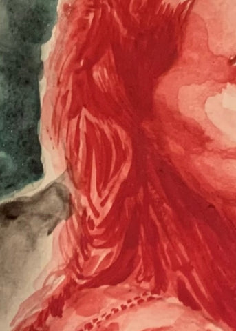

From this point on, I layered paint onto my established darker sections until I was satisfied with the contrast. I also began honing in on finer details. I looked at the direction that the woman’s hair was falling in and used the dry-brush technique* to create a hair-like texture. In areas closer to the shaded sections, I was heavy handed in my paint application, but lightened my pressure up as I got closer towards the back of the head. The reference I chose had some unusual patterns in the woman’s hair, so this is a general map of which directions I used. For the seams of the jacket I got some paint on the end of my brush and lightly made dots along the seam. The dots don’t need to be perfect circles, I just recommend using a relatively dry brush and keeping light pressure as you make the seam texture. I used a similar technique along the man’s jawline to create facial hair, but I used water on the brush and dotted off the access paint before layering again.
*The dry-brush technique is when you take a dry paintbrush, add paint, wipe off the excess paint, and brush it onto your medium to create a stringy, hair-like texture.
I did not like the background I had originally planned to use, so I decided to add some complimentary colors* to make the couple’s colors pop. I used Waves of Expression’s shimmery green watercolor paint to add to the romantic atmosphere of the scene. I also added a darker shade of Phthalo Green, followed by a mix of Phthalo Green and Crimson red to create a loose color gradient. At this point, there still wasn’t enough contrast with other aspects of the background so I added more Ivory Black to the abstract rock formation. I followed this up with a halo of Waves of Expressions’s rust orange glitter watercolor. It pushed the man’s blue forward while remaining absolutely gorgeous on its own. I added a shock of hot pink glitter watercolor to the woman’s cheeks and lips, Blue glittery watercolor to the man’s cheeks and hair, and officially declared the piece done.

All in all, I had a ton of fun painting his piece and it’s definitely one of my favorites. While the choice to paint two people made it challenging, the colors, textures, and glitter kept me so involved and inspired the entire way through. I love adding that extra shimmer to my paintings and I genuinely hold the belief that it adds a little magic every time. I thoroughly enjoyed the process of this piece and I hope you guys enjoyed it too.